Redesigning a Gym Website Landing Page
May 27, 2024
The Project
My goal was to redesign a gym website for a new gym owner in my hometown. The gym is already successful and has many monthly members, but their online presence is unprofessional and difficult to navigate.
The Problems
24/7 Fitness Arizona's website is only one page, it allows users to sign up which takes them to an external website. The only information it hosts is basic such as gym hours, contact information, a Facebook link, and a small bit of sales copy.
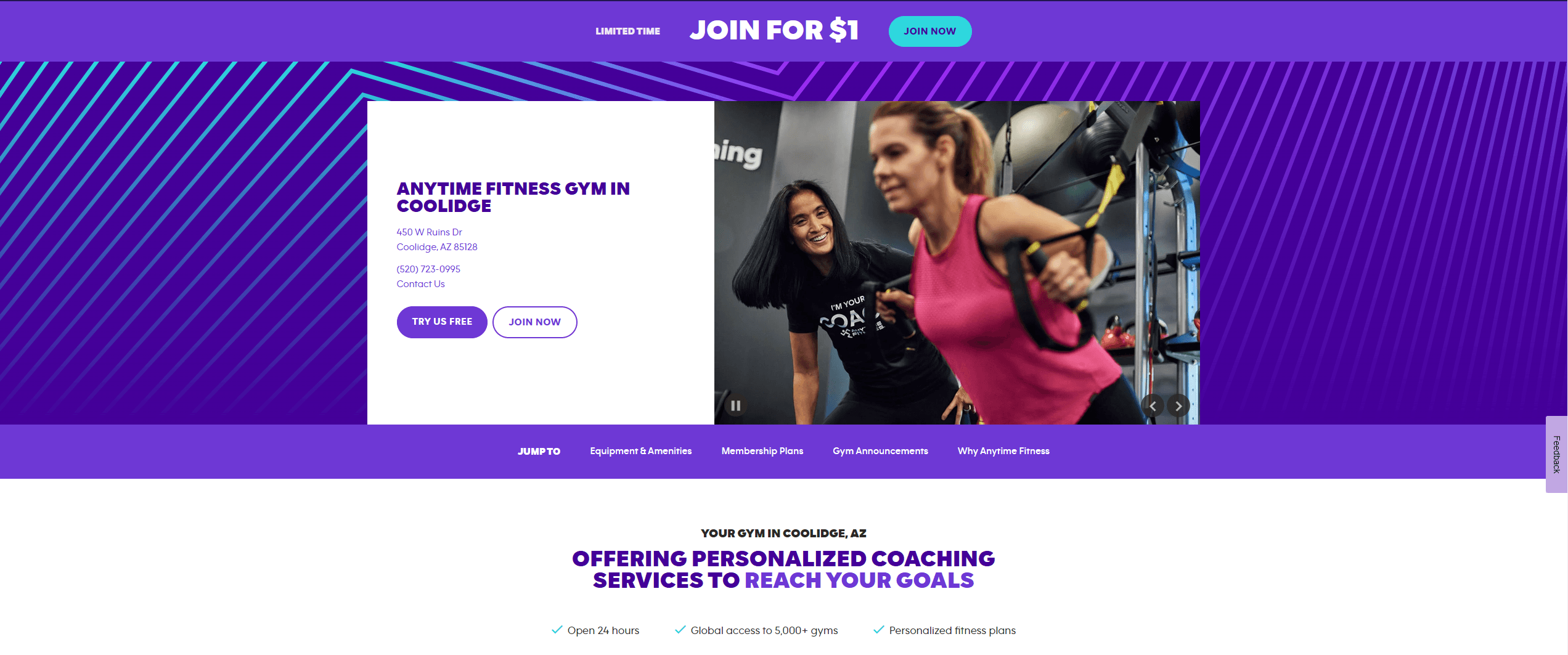
Due to the little information on the website, their direct competitor down the road (a franchise gym) has a stronger online presence, including images of the gym, more information, and a benefits section. Compare the two hero pages below:
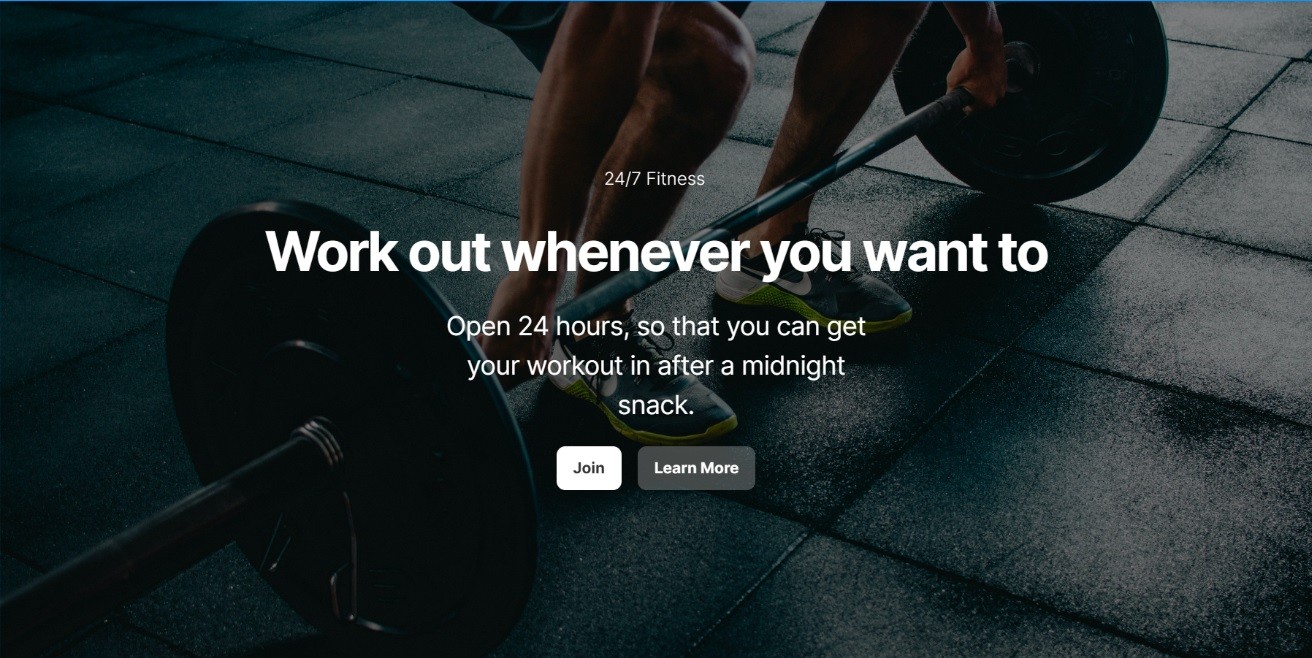
24/7 Fitness AZ Landing Page

Competitors Landing Page
My Approach
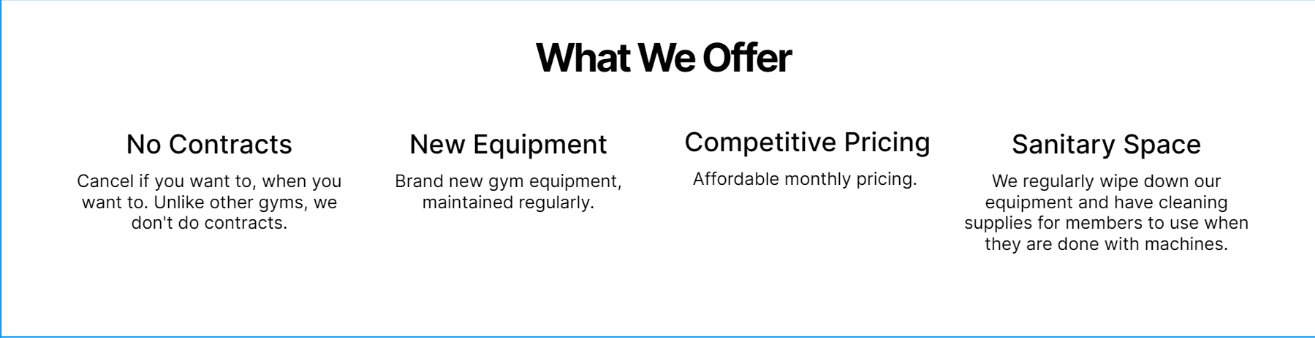
No Contracts
The biggest advantage that 24/7 Fitness has over their competitor is that they don't have contracts, which means members can join and leave anytime they want. The gym is located in an area that has many seasonal visitors, which makes having no contracts especially enticing to the visiting crowd. Because this benefit of the gym is so important, I wanted to use it on the landing page to make this information more obvious to the websites visitors.
Open 24/7
It's even in the name of the gym itself — they are open 24/7. This is the biggest selling point of the gym and should be recognized as such. The competitors gym is also open 24 hours, but they have placed that info in a less important spot, with smaller text.
Keeping the Focus on the Customer
The most important thing in user experience writing is to focus on the customer/user of the website, as well as the goal of the business. In this case, we want the user to sign up for a membership, and to do that we need to clearly state the advantages of the gym and focus on why signing up can improve the users life.
Hero Image Copy
I wanted to play into the fact the gym is open 24 hours a day, 7 days a week. I could have written "Open 24/7" like our competitor gym decided to do, but that doesn't focus on the user. Instead, I opted for "Work out whenever you want to", this text focuses on the benefit of being open 24/7 instead, making it much more meaningful to the customer. This text is then followed with "Open 24 hours, so that you can get your workout in after a midnight snack." — A fun bit of sales copy that plays into the idea that the customer could visit the gym even past midnight.
Benefits Section
Just like the competitors site, I wanted to include a benefits section underneath the hero image. This would give me a chance to include the "no contract" advantage of the gym. I decided to also include:
The gyms new equipment
Their sanitary focus
Competitive pricing
Results
Now that this landing page was refinished, the online presence of 24/7 Fitness AZ is more competitive with the gym across the road. Their "no contracts" policy is more clear to online visitors and the hero copy focuses on how it benefits the user.
I also decided to add in an about page, a gallery of the gym equipment, and a dedicated contact page. This project shows how important it is to have a website that can compete with competitors. Online presence is the first impression that a customer may have on a business, so it should be powerful!